Check out these fun new 4th of July themed printable party circles that are now available and have just been added to the Delovely Designs Etsy shop! These are listed for a special rate for this awesome custom set of designs and there will be some more coordinating items added soon including a printable banner, water bottle labels and more!
We are now in the process of starting to offer more items geared for children's parties and have added these fun vintage carnival themed water bottle labels to our Etsy store and will be adding many more children's themed items in the coming weeks. I'd love to hear some feedback and any suggestions on themes that you might like to see added to our growing selection!
I've been working on numerous water bottle label designs lately since we just relaunched the line on Etsy and this is one that I just recently created for an Etsy client, Misty, who is so excited about celebrating her daughter Eleanor's birthday and commissioned me to created these pinwheel themed labels. I just love doing designs for parties and other events and think that this pinwheel motif is so especially fun, so much so that I will likely add this design along with coordinating elements to offer in our Etsy Shop. SO cute and fun, fun, fun to make!
Wanted to share this custom monogram design that I recently created for Tawny and her fiance, Jeremy. Tawny has impeccable taste and was looking for a monogram to be designed to coordinate with the invitation design that she previously had designed with another invitation company and I must admit I was delighted when I saw the photo of the invitations and the gorgeous lace and vintage rose motif that she desired to carry throughout the stationery items for her special day. The invitations are gorgeous and even more amazing, printed on wood! Yes, a stunningly feminine motif of delicate lace and vintage roses printed on a wooden veneer invitation insert. LOVE these and as a matter of fact, Delovely Designs will be offering these unique invitations soon as well! (I will be sharing more details on that soon.)
Even though the design below wasn't Tawny's final selection for her custom monogram, I just loved it so much that I couldn't resist sharing it here. Loving the color palette of rich merlot and cocoa tones and the lovely heirloom feel of this design!

Many more designs to come from Claudia and Joe's fall nuptials including a real weddings post, but for now here's a little taste from their special day. A custom monogram that I lovingly designed for this very special couple who also happen to be very dear friends of yours truly! Isn't it gorgeous?!?!
And the winner is........Samantha! Thank you for Showing Your Love for Delovely and becoming a fan! I have sent you a message to contact me regarding your monogram package and look forward to designing some gorgeous monogram designs for your special day!
Thanks to all that entered and to all of our fans, you are amazing! Hope everyone has a fabulous weekend! Have fun and stay safe!
So, I mentioned a while back that we would be doing a contest soon and well, now is THE time! Our new website is *still* under construction for now and might be a while longer before the official release, but that's no excuse to wait, am I right!?!?! ;)
The contest will begin today and will run through next Thursday, April 29th with the winner being selected and announced on Friday, April 30th. The winner will get a stock monogram package including three stock monograms of their choice that will be forwarded to them as high-resolution digital files that they may then use at their own discretion for any project they choose.
In order to enter the contest you must do at least one of the following and then COMMENT on this post describing which item you did. You may do more than one of the items listed below for additional entires, however you must leave a separate comment for EACH thing you do in order to get all of your entries.
- Follow the Delovely Designs blog publicly. (1 entry)
- Follow the Delovely Designs blog via email. (1 entry)
- Become a fan of Delovely Designs on Facebook. (1 entry)
- Share this giveaway with your friends on Facebook. (1 entry)
- Follow Delovely Designs on Twitter and Tweet about this giveaway. Make sure to include @delovelydesigns within your tweet. (1 entry)
- Blog about this giveaway and link it back to this post. (1 entry)
Make sure to include your email address within your comments so that I may easily contact the winner once she/he has been selected. Good luck!
We are back on Etsy and in fact, I just listed our oh-so ever popular water bottle labels on our new Etsy storefront. These are highly water and weather resistant labels printed on a professional / commercial short-run label printer and are perfect for that special added touch for water bottles that you might have available for an outdoor wedding ceremony, for a wedding shower, baby shower or birthday party and wonderful for out of town guest amenity bags as well. The labels I have included in the listings are designed with weddings in mind, but I can create these for any occasion so please just convo me or send me an email should you have a special request. I will be listing more items soon, but if you are looking for water bottle labels for an upcoming wedding or other special event or occasion be sure to check it out!
http://www.etsy.com/shop/DelovelyDesigns
Due to the overwhelming positive response to our Step Into Spring Monogram promotion, we are extending this special promotion throughout the months of April and May! For anyone who isn't familiar with the promotion, here's what you're missing out on. ;)
Buy any three stock monogram package and receive a complimentary fourth stock monogram to complete your design package! Monograms will be delivered to you via email and as a high-resolution jpg and / or pdf file which my then be used for a plethora of ways to personalize your special day.
If you are interested in taking advantage of this great promotion or should you wish to get a copy of our pricing list and other information regarding what services we offer, please email us and we will be delighted to answer any questions that you might have!
I am thrilled to announce our Step Into Spring monogram promotion that we will be offering until the end of March. Anyone who purchases our three stock monogram option will get a fourth stock monogram of their choice for free! So, four chic stock monogram designs crafted to your specific needs designed using your wedding information and color palette and for the price of three stock designs! This is an awesome way to create a fun personalized theme throughout your event and to still be able to tie everything together into a cohesive concept as you can use different designs for different stationery items, favors or other decor items as well. What are your favorite ideas for monogram usage? I always love hearing from brides and even grooms about the fun and creative plans they have for the lovely designs I make for them. I am constantly amazed by the creativity of my clients and how the final results turn out once they take one of my designs and create something interesting and original for their special day!
Please email us should you be interested in placing an order for stock monogram designs for your upcoming event or if you are interested in any of our design or printing services. We'd love to create something Delovely for you!
Just a teaser for the upcoming real weddings feature for Katie and Wayne's chic summer wedding this past August. Such a fabulously fun couple and I cannot wait to share their special day with you!!!
Image courtesy of Jasmine Photography ~ http://www.jasminephotography.com/
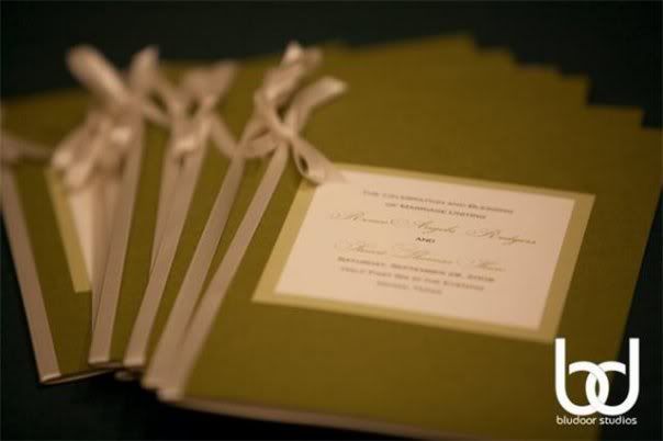
Photography by BluDoor Studios
Coming soon.....Delovely will be offering a wide variety of favor boxes perfect for weddings, events and other special occassions such as bridal and baby showers. Available in 10 different styles and in 30 Stardream Metallic Colors to select from. Ribbons, labels and seals are sold separately, but are available options... to provide a finished look for these pretty little favor boxes! Full color digital printing will be available as an option for an additional fee. Please email me for more information and pricing if you are interested. These will be available after the beginning of 2010, however if you have a request before then please email me regarding your event and I will let you know if I am able to coordinate for you on a rush order basis.

P R I C I N G
MONOGRAMS
wedding / baby / personal
Stock Monogram Designs
$ 15.00 for 1 design
$ 25.00 for 2 designs
$ 32.00 for 3 designs
Custom Monogram Design
starts @ $ 75.00 for 1 design
INVITATIONSCustom Invitation Design
**contact us for a quote
Flat panel invitation design including single main invitation insert and reply card starting @ $ 125.00 for the design of both inserts. No printing materials included in price.
Printed custom invitation suites are now available and are quoted on an individual basis. Single flat panel main invitation and reply card with coordinating envelopes start @ $5.00 per invitation and include digital printing for the inserts only. No envelope printing included in this price. Design fee, coordination and any assembly fees will be included in custom invitation quotes when requested.
We offer flat digital printing for our classic invitation collection, however also offer offset flat printing, thermography and letterpress printing as options as well. Please contact us to discuss a custom design for your upcoming wedding or special event today!
SAVE-THE-DATES
Custom Save-the-Date Design
$ 50.00 for a single one-sided layout design
$ 75.00 for a two-sided layout design
Printed Custom Labels / Stickers
Water Bottle Labels - 8" x 2" water resistant white labels
100 labels - $ 80.00
200 labels - $ 160.00
300 labels - $ 240.00
400 labels - $ 315.00
500 labels - $ 390.00
600 labels - $ 465.00
Larger quantities - contact me for quote
1.75" Circle Labels - water resistant white labels - can be used as favor labels or return address seals among other things
100 labels - $ 30.00
200 labels - $ 60.00
300 labels - $ 90.00
400 labels - $ 120.00
500 labels - $ 150.00
600 labels - $ 180.00
Larger quantities - contact me for quote
2" Square Labels - water resistant white labels - can be used as favor labels or return address seals among other things
100 labels - $ 45.00
200 labels - $ 90.00
300 labels - $ 135.00
400 labels - $ 180.00
500 labels - $ 225.00
600 labels - $ 270.00
Larger quantities - contact me for quote
2 1/2" Circle Labels - water resistant white labels - can be used as favor labels or return address seals among other things
100 labels - $ 50.00
200 labels - $ 100.00
300 labels - $ 150.00
400 labels - $ 200.00
500 labels - $ 250.00
600 labels - $ 300.00
Larger quantities - contact me for quote
3" Square Labels - water resistant white labels - can be used as favor labels or accents on invitations, programs, etc.
100 labels - $ 55.00
200 labels - $ 110.00
300 labels - $ 165.00
400 labels - $ 220.00
500 labels - $ 275.00
600 labels - $ 330.00
Larger quantities - contact me for quote
4" Square Labels - water resistant white labels - can be used as favor labels or accents on invitations, programs, etc.
100 labels - $ 60.00
200 labels - $ 120.00
300 labels - $ 180.00
400 labels - $ 240.00
500 labels - $ 300.00
600 labels - $ 360.00
Larger quantities - contact me for quote
***All labels are printed on a highly water resistant glossy label stock using a commercial label printer
BIRTH ANNOUNCEMENTS
Custom Birth Announcements
**contact us for a quote
CORPORATE
Corporate Logo Design
Starting at $ 200.00
Business Card Design
One sided design - starting at $ 60.00
Two sided design - starting at $ 80.00
Letterhead Design
Starting at $ 40.00
Other Custom Designed Marketing Materials
**contact us for a quote